
01
Create a recognizable identity
Create a distinctive wordmark and circular balance symbol that remain recognizable across the website, document folders and stationery.
A confident legal identity built around a distinctive wordmark, navy, slate blue and silver. From brand strategy to the website experience, every detail brings clarity, credibility and a personal approach to legal services.
Explore the project
Micheal is a concept identity for a contemporary law firm serving individuals and growing businesses. An Unbounded wordmark, navy, slate blue and silver balance professional authority with a welcoming, personal tone.
The project connects brand strategy, logo design and visual identity with a focused website concept. Three separate website previews make the homepage, expertise and enquiry journey easy to inspect without compressing the whole page into one image.
Create a distinctive wordmark and circular balance symbol that remain recognizable across the website, document folders and stationery.
Pair navy, slate blue and silver with white space and natural portraits to communicate authority without feeling distant.
Help visitors understand the firm’s expertise, identify relevant support and see how an initial enquiry works.
Keep the same logo, portrait direction and visual language across brand boards, stationery mockups and website sections.
Four decisions shape the Micheal identity and website direction.
An Unbounded wordmark and circular balance symbol create a recognizable signature.
Navy, slate blue and silver establish a calm, confident palette.
A consistent male lawyer portrait and natural professional settings add a human presence.
One logo system, shared colors and clear calls to action connect every touchpoint.
An Unbounded wordmark, circular balance symbol and horizontal lockup define the Micheal signature.
Navy, slate blue, silver and white support distinctive brand typography and a clear digital hierarchy.
Document folders, letterhead and business cards demonstrate consistent logo use across physical touchpoints.
A navy hero, slate calls to action and a concise introduction establish the firm’s digital presence.
Photographic practice-area cards and clear service categories help visitors find relevant legal support.
A four-step process and a focused contact form explain the path from first conversation to next steps.
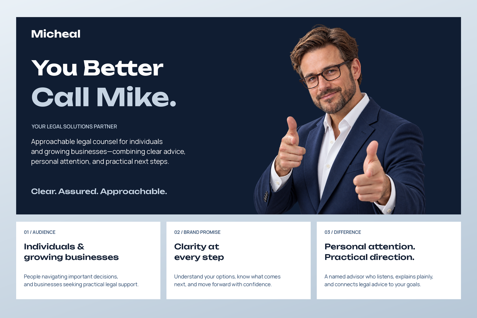
“You Better Call Mike.” introduces approachable legal counsel for individuals and growing businesses. Clear advice, personal attention and practical next steps define the promise, supported by a confident, human portrait.
Open this deliverable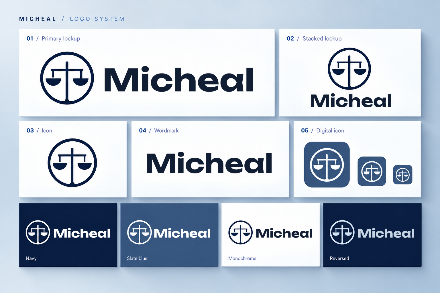
The Micheal wordmark uses Unbounded Bold and pairs with a circular balance symbol. Horizontal, stacked, standalone and reversed applications create a recognizable identity across print and digital touchpoints.
Open this deliverable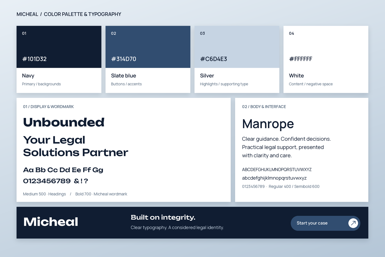
Navy, slate blue, silver and white establish a calm, confident palette. Unbounded brings character to the wordmark and headings, while Manrope keeps body copy and interface labels clear.
Open this deliverable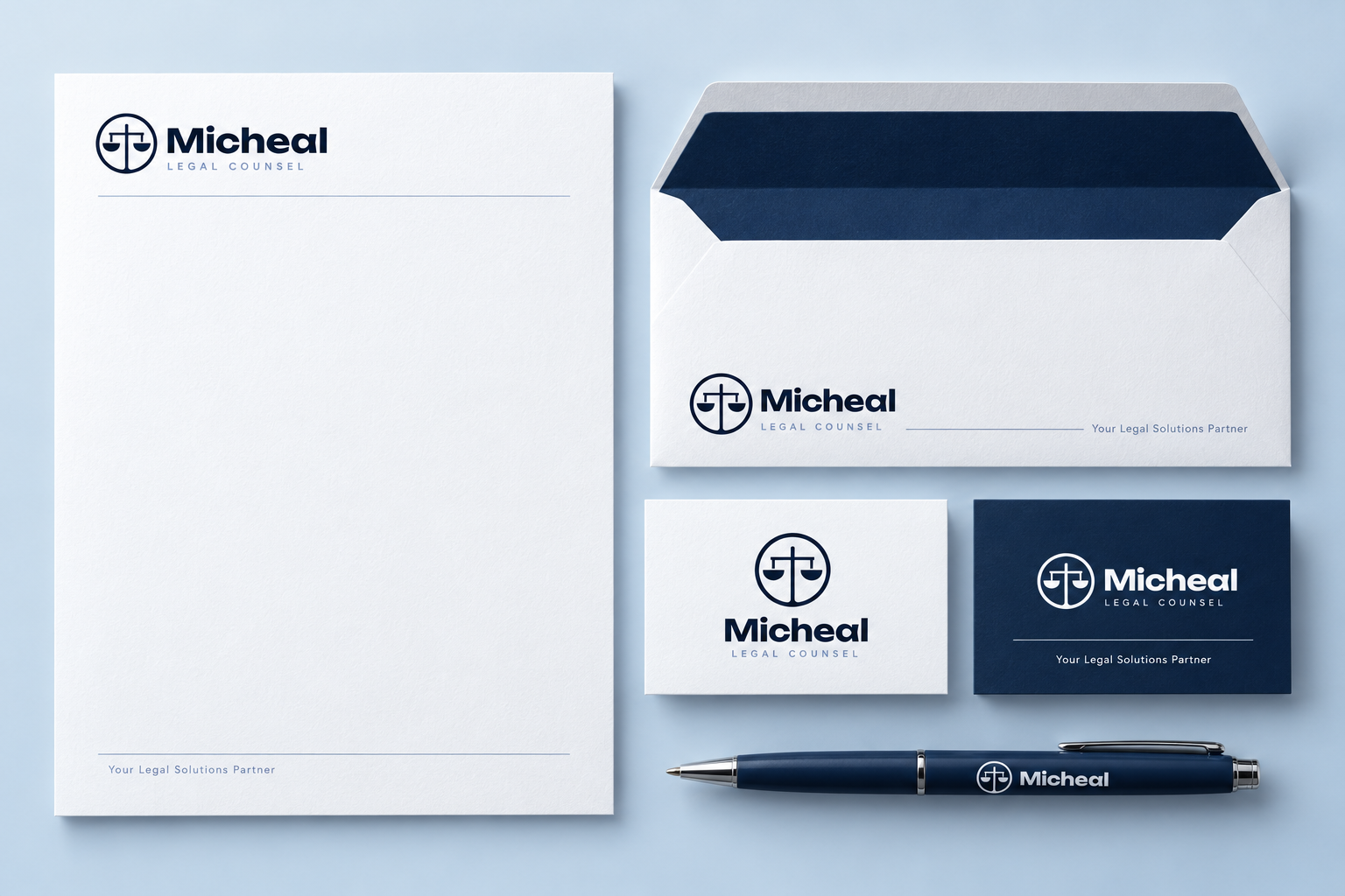
White letterhead, a navy-lined envelope, business cards and a branded pen extend the identity into correspondence. Consistent wordmarks, balance symbols and restrained rules bring the same clarity to every piece.
Open this deliverableThe homepage pairs Micheal’s blue-suit portrait with a clear legal proposition, subtle balance imagery and slate calls to action. Spacious sections introduce the practice and guide visitors toward relevant services.
Open this deliverable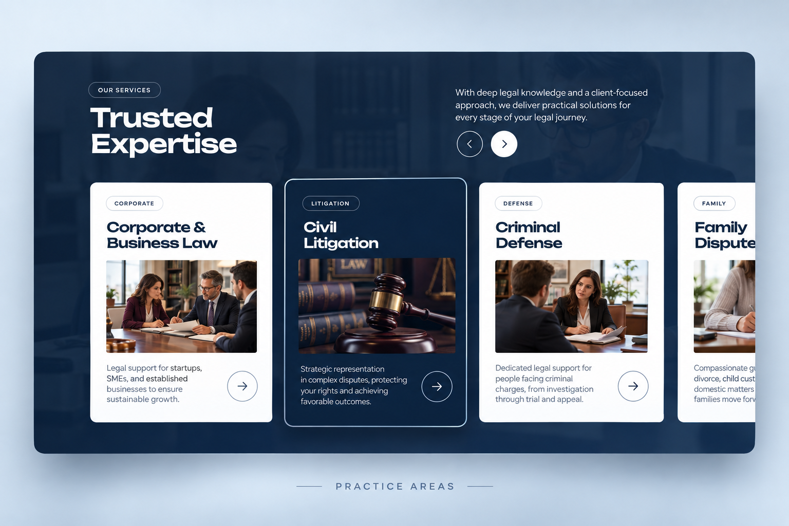
Photographic practice-area cards make legal expertise easier to explore. Clear categories and a consistent navy-and-white layout connect each service to a direct next step.
Open this deliverable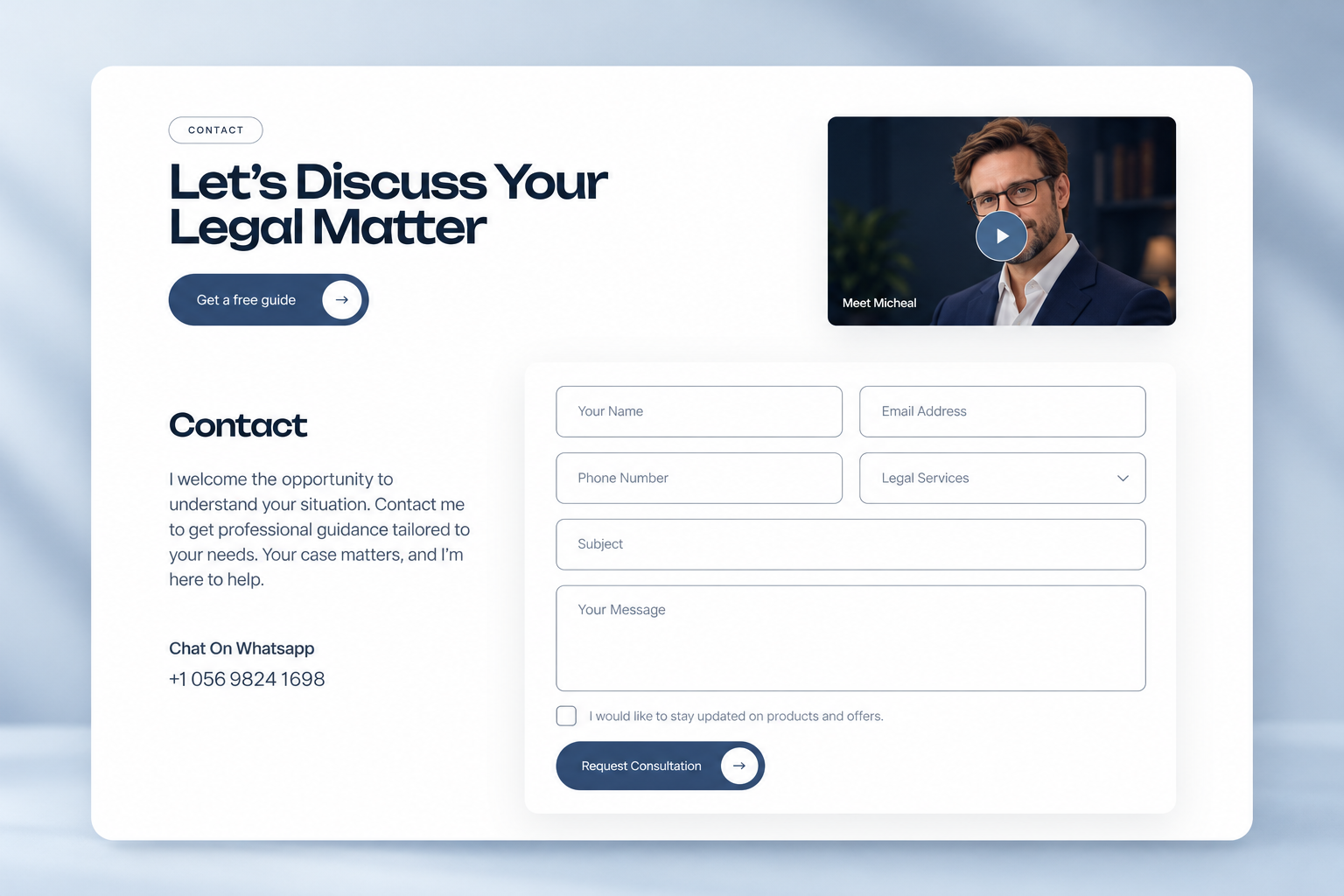
A clear invitation to discuss a legal matter leads into a focused enquiry form. Supporting contact details and a video preview give the first conversation a more personal feel.
Open this deliverable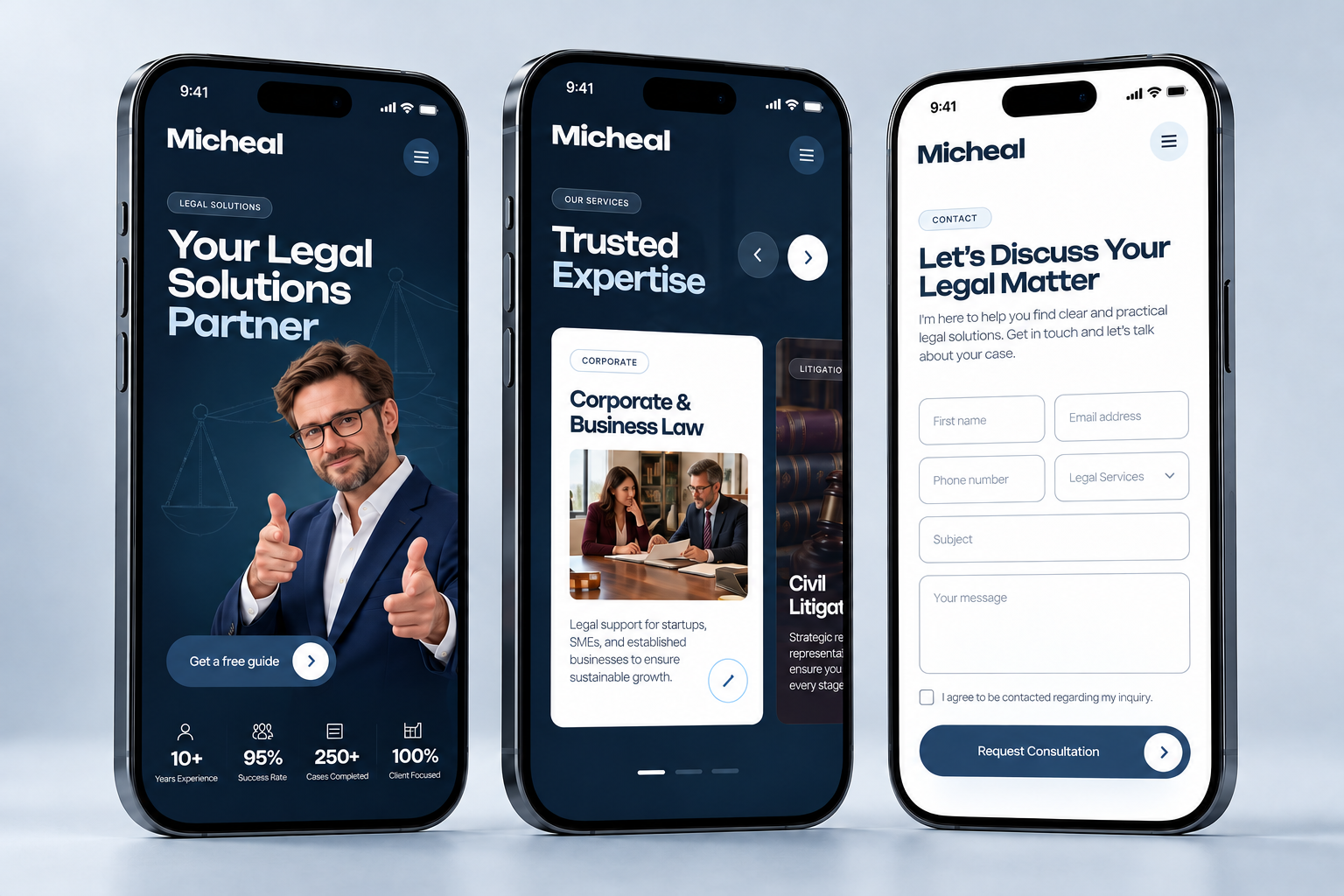
Mobile layouts carry the homepage, service discovery and enquiry experience onto smaller screens. Clear type, stacked content and prominent actions preserve the same visual identity.
Open this deliverable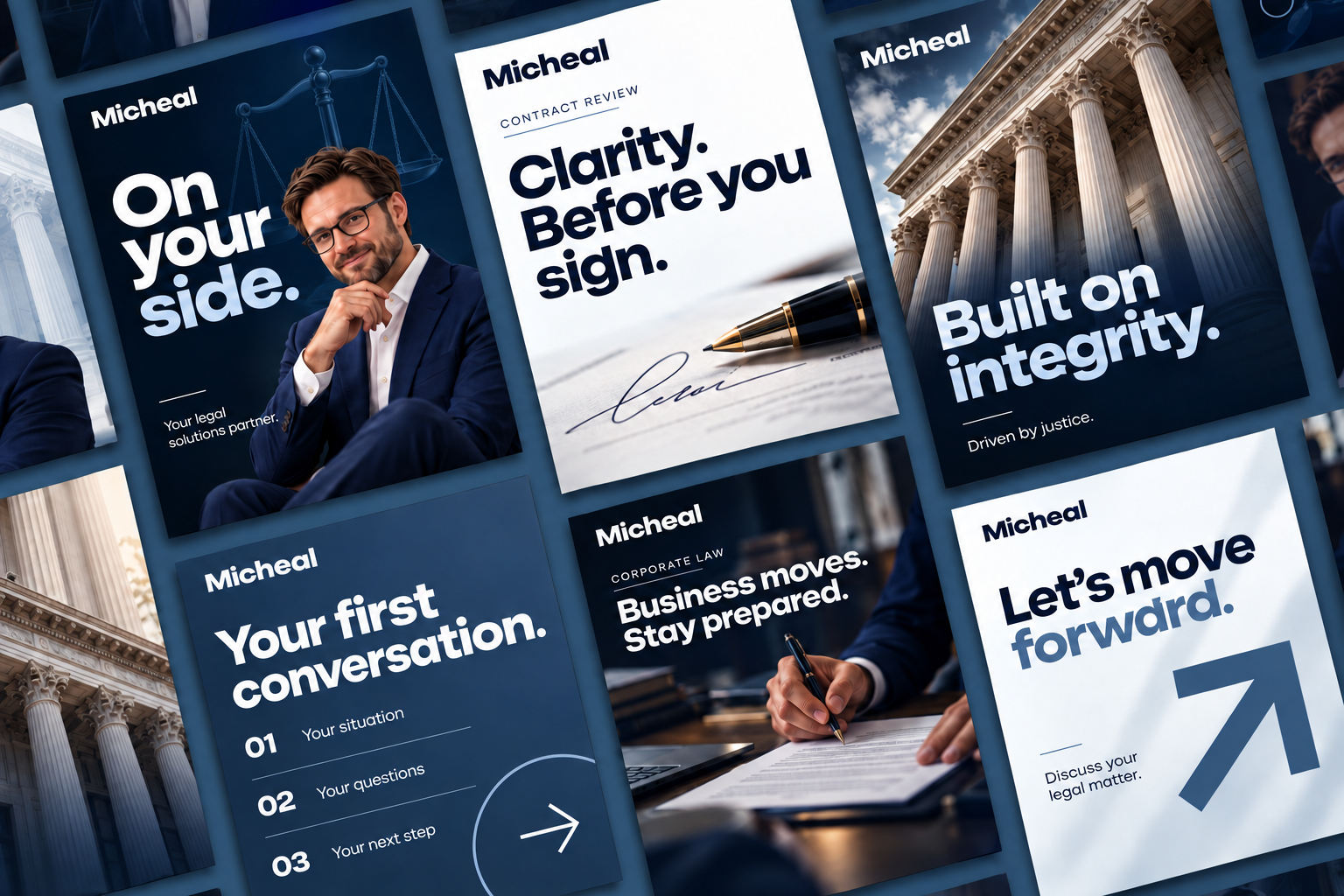
A coordinated set of portrait social posts combines human photography, concise messages and the Micheal palette. Consistent 4:5 compositions bring the brand’s approachable, assured personality into the feed.
Open this deliverableThe distinctive Micheal wordmark and navy-and-silver palette create a recognizable signature.
The identity connects strategy, stationery and the homepage, expertise and enquiry sections.
Consistent logo applications, portraits and color choices give the project a coherent visual character.
These outcomes describe the design work shown; they do not represent measured business or conversion results.
The wordmark, restrained palette and natural portrait direction balance confidence with approachability.
Separate homepage, expertise and contact previews make each part of the website concept clear and easy to review.
Consistent logo use, a defined palette and repeated interface patterns give future materials a clear visual foundation.
Concept project: Micheal branding and website design. Portraits and review figures within the visual mockups are illustrative. Website screens demonstrate design only; no live legal service or enquiry form is represented.

From a distinctive identity to a focused website, let’s create a brand experience that feels confident, clear and consistent.